 Published by Simon Bell
Last updated on July 10, 2026
•
8 minute read
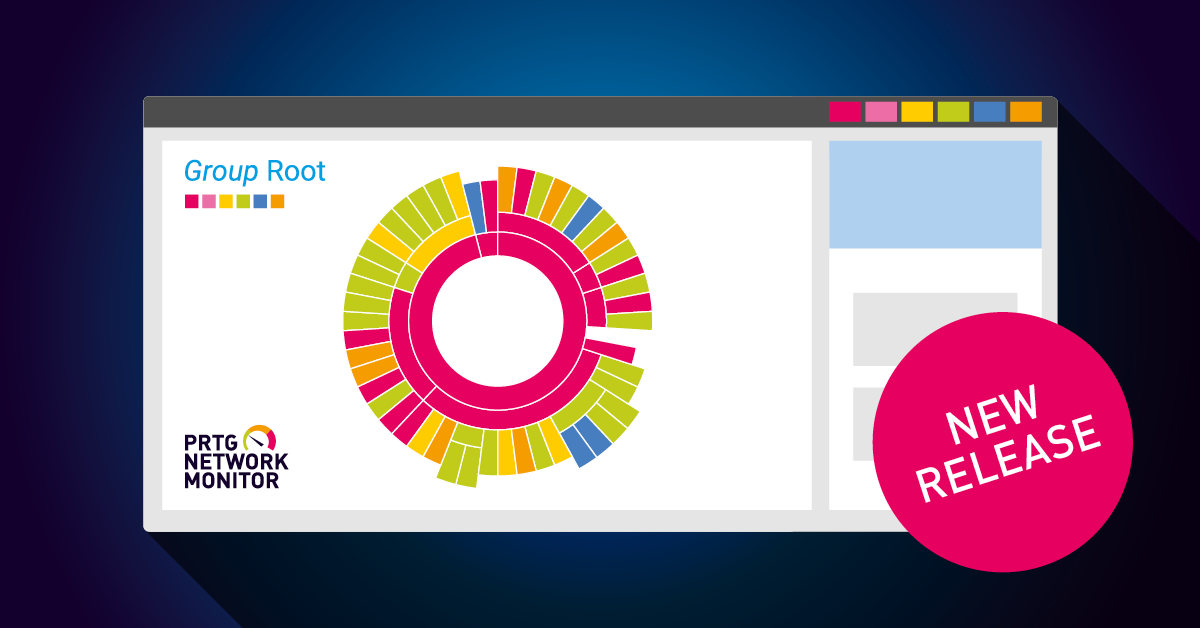
Top 10 lists? WAN diagrams? Sunburst views (or as one of my customers with a poorly behaving network calls it, “The Donut of Doom”)?
For most users, their favorite PRTG maps will depend on their job function – a network engineer will have different requirements to a storage admin, who in turn, will have different needs to a service desk technician. But one of the great features of PRTG is that it can meet ALL these differing needs, and more besides…


But what about outside of IT? Well, through the use of custom sensors, some scripting skills and a little imagination, PRTG can act as a centralized information display for your whole business. In Paessler’s Nuremberg HQ we have large wall-mounted displays throughout the offices. These present various data sets for different departments by collecting and collating operational data using PRTG. For example, here’s the display in our Tech Support area:
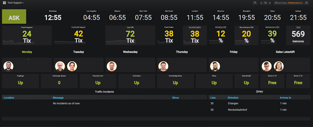
- The top row shows the time in different cities; we work with customers all over the world!
- Next, we have stats from some of our backend systems.
- Then, a calendar showing which colleagues are covering the extended hours shifts this week.
- Below that, there are simple status checks for our public facing web services, together with a free/busy indicator for the two shared meeting rooms in the TS area.
- Finally, we see two external data feeds, the left-hand one reporting traffic problems in the local area; and the one on the right shows the ETA and destination of the next buses to arrive outside the office (Being German, they’re ALWAYS on time 😉).
Now, the keen-eyed among you will have spotted that this dashboard looks nothing like a standard PRTG map, and that’s because it’s not. In fact, this is a Grafana dashboard, and we’ll be looking at what Grafana is and how you can integrate it with PRTG later in the article.
But before we move on to that I wanted to talk about some techniques that you can use to share PRTG derived data with all areas inside your business.
Sharing PRTG with the Business
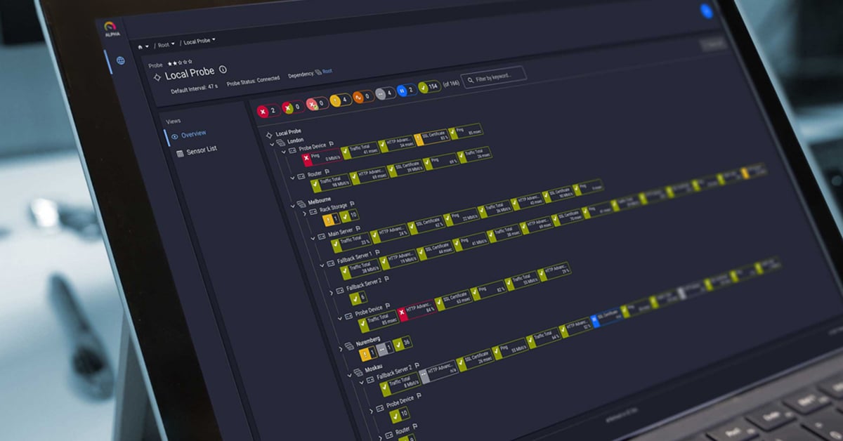
For the IT Operations Team, detail is a good thing – they need a clear and concise view of all the components of the systems they’re managing, and they also require an immediate indication when things are going wrong. A good example of this would be this PRTG map showing the health of an Exchange email system:
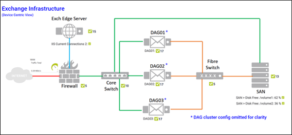
This level of detail is great for IT as it allows them to see which subsystem(s) are causing a problem. It’s entirely device focused, which is what the IT Admins need to see. But that’s way too much information to share with the rest of the business; who (mostly) don’t care about the lumps of metal and flashing lights that deliver the services they rely on. All they need to know is whether those services are available.
For that, we need to present a service-centric view of the infrastructure, rather than the device-centric view that IT Admins rely on, whilst preserving the overall status information.
For example:
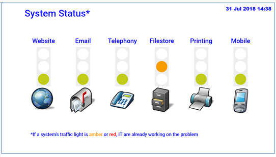
Presenting a map like this on the intranet, or on information screens throughout the office, quickly lets the business know the status of the services they rely on to do their jobs (The footnote at the bottom could also help cut down on duplicate Service Desk tickets 😉).
Behind each of the service traffic light status icons, there is a Business Process Sensor (BPS) that’s been configured to aggregate the health and performance metrics for all the components that comprise that specific service. Limits set on the BPS channels determine the conditions that trigger a state change resulting in a color change to that traffic light.
A detailed example of using BPS with Microsoft Exchange can be found here - PRTG & The Exchange Admin– Monitoring Exchange as a Business Service; but the same principles can be applied to any group of sensors or devices within PRTG.
What about using other data sources in maps? As long as the data is presented in a format that PRTG can work with, then yes, absolutely! There are countless websites with APIs that can be interrogated by PRTG Custom sensors to return useful data.
A couple of examples are shown here: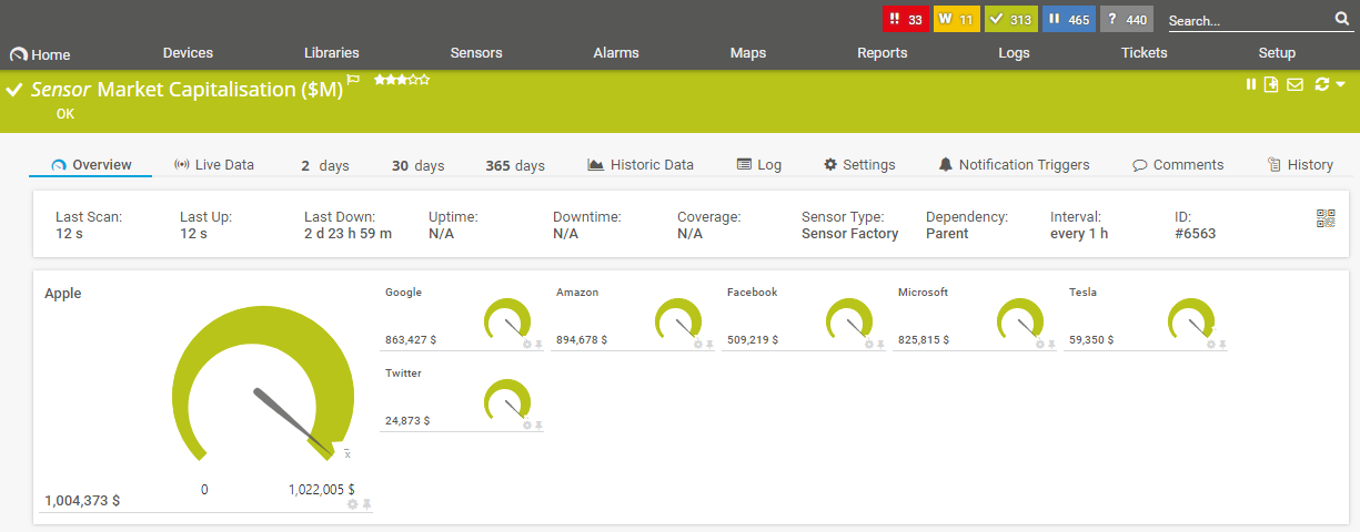
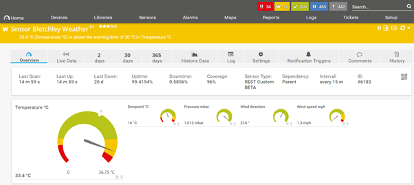
This “market capitalisation” sensor uses PRTG’s REST Custom Sensor to pull data from the API of a publicly accessible share price site, in this case IEX, with no credentials needed. All we need to do is specify the API URL in the sensor configuration, and in this example PRTG retrieves the share information for Apple (company identifier AAPL):
 Other sites, such as Weather Underground, require users to register before they can use the site’s API. In those cases, the unique user ID (or API token) must be included in the REST query:

It’s also important to read and comply with the license agreements for any API you intend to use in your maps. For example, some sites restrict the number of API calls that can be made, if you have not paid for a commercial license.
Sharing PRTG with Other Tools
So far, we’ve been looking at ways to pull external data into PRTG. But what if you want to use PRTG data in other dashboard tools? Well, thanks to the PRTG API, this can also be done, with little effort.
One very popular example is Microsoft Power BI, a suite of powerful business analytics tools that can pull data in from multiple sources, including Excel, databases, CRM systems, social media analytics feeds, and literally dozens of other data sources. Of most interest to PRTG users is the Web Data Connection feature, as this allows Power Bi to pull data from PRTG’s REST API.
Here’s an example of just that:
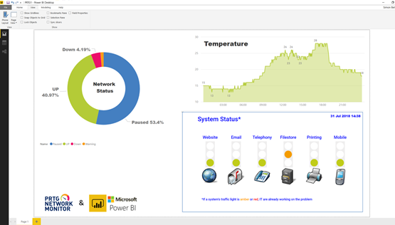
- Here we see the results of a PRTG API call to retrieve the number of sensors currently in each of the Up / Warning / Down / Paused states. The raw JSON data was processed using Power BI’s query tool; the sensor counts were then converted to percentages, and finally the results are displayed as a “Donut Chart”.
- Another API query was used to retrieve a “Historical Data” report from a PRTG temperature sensor. Again, Power BI parsed the JSON data and converted it into a table suitable for populating an “Area Chart”.
The online version of Power BI allows external data sources to be added to dashboards as “Tiles”. This was used to create an “iframe link” to the publicly accessible PRTG map we saw earlier in the article (Please note that the Tiles feature is not currently available in the Desktop version of Power BI).
Combining the PRTG API with Power BI makes it easy to incorporate live or historical infrastructure and service metrics into dynamic and informative business reports. These can then be combined with data from other business systems such as CRM or ERP systems to produce detailed SLA or KPI dashboards.

A great open-source alternative to Power BI is Grafana. It too provides the tools to combine data from multiple disparate data sources and combine them into beautiful and dynamic dashboards. As with Microsoft’s Power BI, Grafana can be run on premises or as a cloud hosted service. A GitHub user, Jason Lashua (aka neuralfraud), has written a PRTG datasource for Grafana that makes it simple to visualise PRTG data using Grafana’s stunning data visualisation capabilities. More examples of what’s possible (and details of how to get it running) can be found in this blog post: PRTG plus Grafana FTW!
Let us know about your dashboard solutions in the comments below!