.jpg) Published by Jasmin Kahriman
Published by Jasmin Kahriman
Last updated on January 23, 2024
•
7 minute read
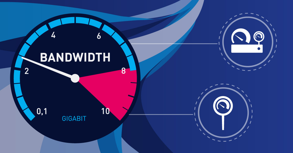
One of the questions we often hear is: How much bandwidth do the PRTG core server and remote probe consume in a specific time frame, and how can we visualize it on a dashboard? Well, there is no single answer here. It depends on a few factors, such as the number of remote probes, the number of sensors and channels, as well as the scanning interval. For example, 100 SNMP sensors, each with 2 channels (in & out) generate roughly 1 kbit/s plus 20 bytes/minute (due to the core "keep-alive" message). This reflects a daily load of about 11 MB a day. If you´d like to see the math behind this number, please check this page.
For the sake of context, a few years ago our reseller Omicron AG from Switzerland set up an installation of PRTG with 10,000 SNMP sensors for one of their customers. For traffic monitoring, this setup consumes very little bandwidth. And within minutes, they could see that they were only generating 400 kbit/s of network traffic for 10,000 sensors with one minute scanning interval (which is less than 3 kbit/s per switch)!
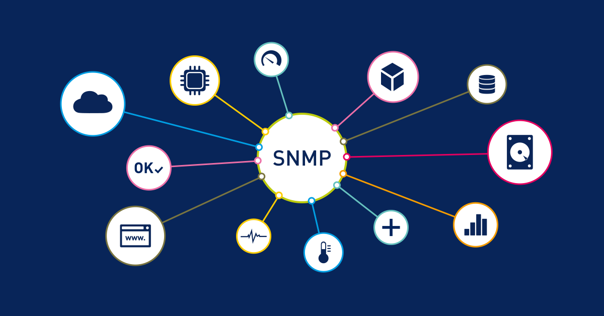
If you are not familiar with PRTG and you are wondering what the PRTG core server and remote probe are, you can read more on this page.
In this article, I´ll walk you through the procedure of monitoring bandwidth between the PRTG core server and remote probe by using the Packet Sniffer sensor, which comes out-of-the-box with PRTG.
Add the Packet Sniffer sensor to the probe system
Packet Sniffer sensor comes into consideration if your network devices do not support SNMP or flow protocols to measure bandwidth usage and if you need to differentiate the bandwidth usage by network protocol and/or IP addresses. It is important to understand that the Packet Sniffer sensor can only access and inspect data packages that flow through the network interfaces of the probe system. To monitor other traffic in your network, you can configure a monitoring port (if available) that the switch sends a copy of all traffic to.
In order to get more insight into bandwidth usage between the PRTG core server and remote probe, you should add a Packet Sniffer sensor to the remote probe, choose the active/used network card, and add a corresponding filter. As remote probes communicate with the core server via the TCP 23560 port, the filter includes the entry DestinationPort[23560]. If you use another port, please update the filter accordingly.
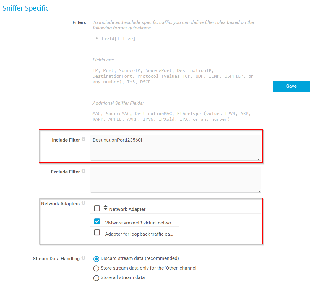
Once you are done, click Save. Yes, that is all.
Follow the same procedure on all other remote probes. Give it some time until the Packet Sniffer sensor gathers more information about bandwidth usage. Once the sensor is ready, we can take leverage the data visualization of PRTG by creating maps (dashboards), reports, or by exporting some data (e.g. graphs) via API.
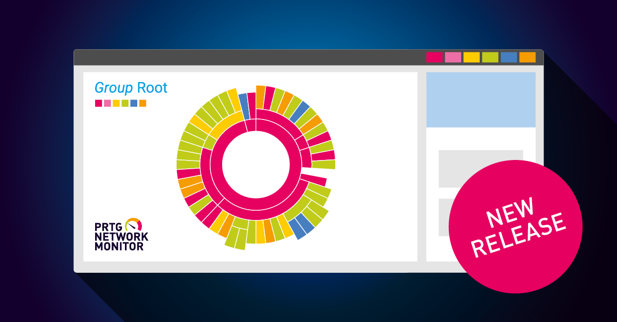
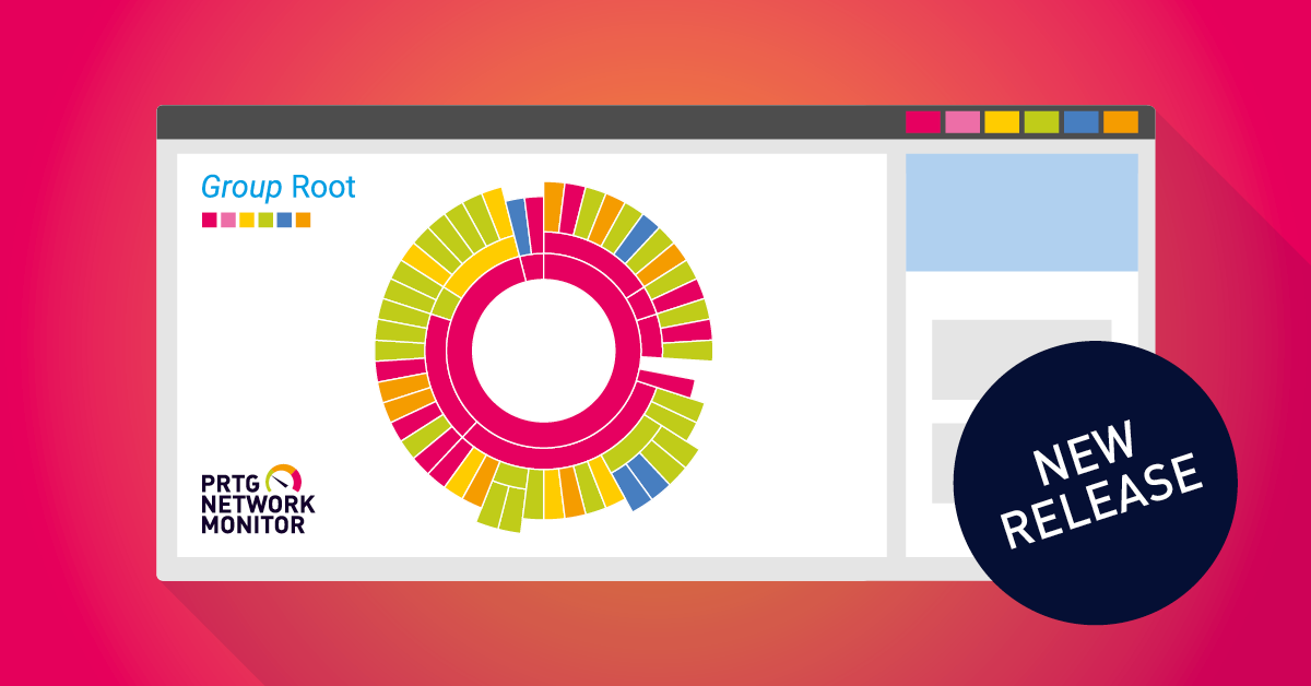
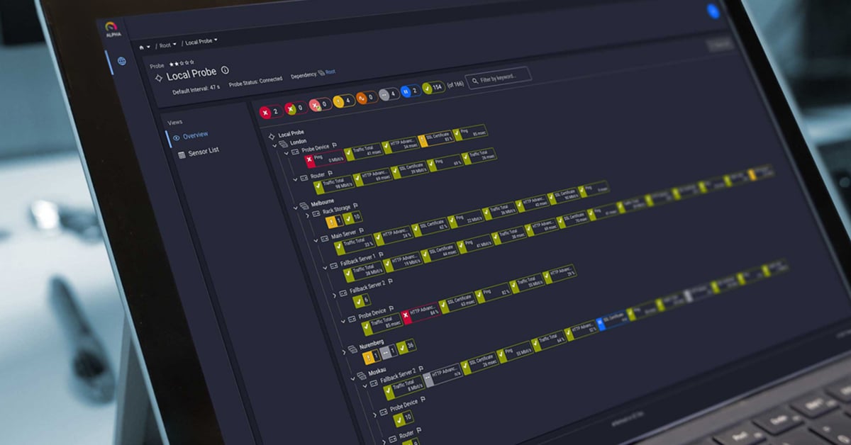
Data visualization
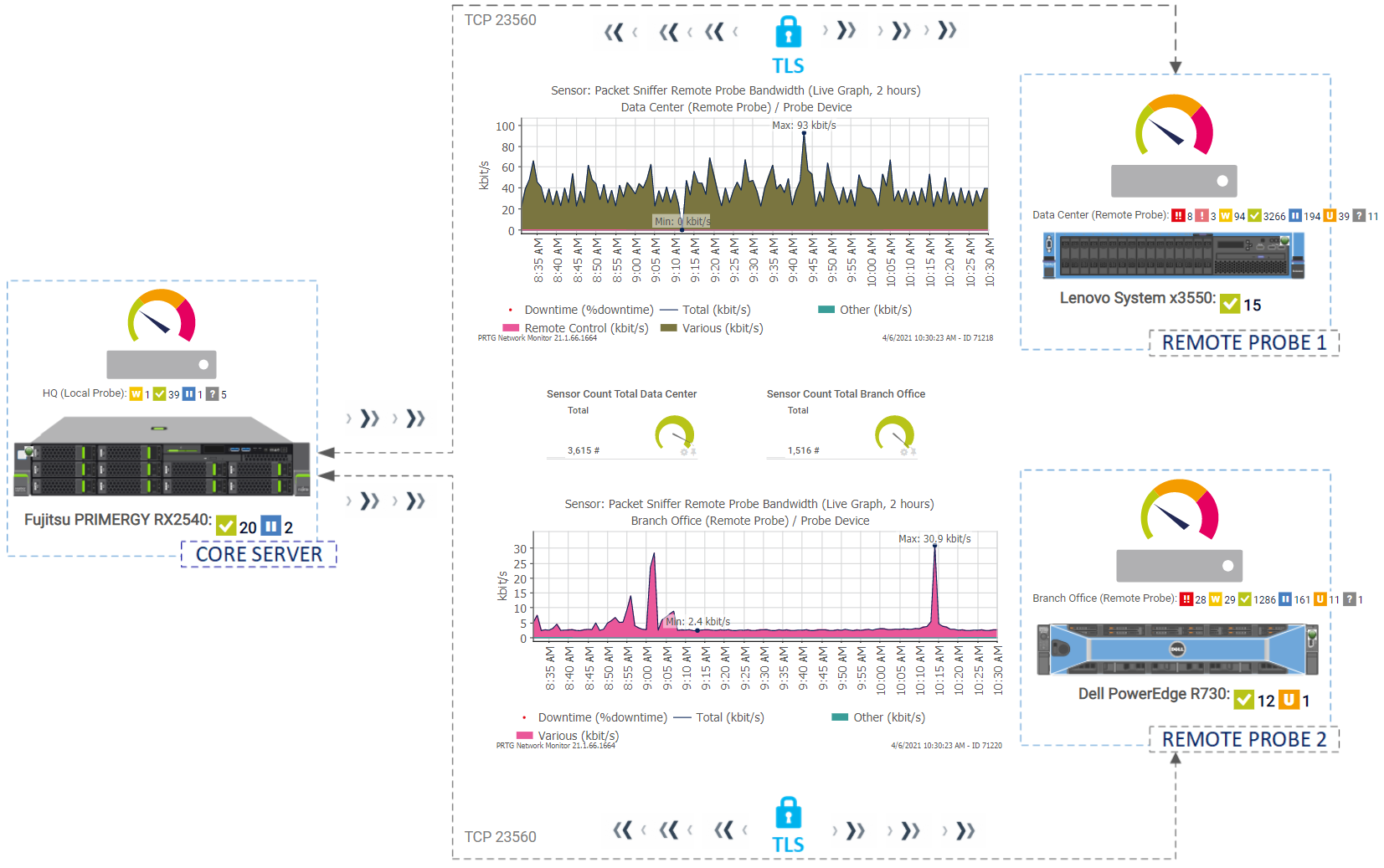
The logical step after adding devices and sensors in PRTG is to visualize them on the map and keep an eye on changes. As you can see on the map below, I have a single PRTG core server and two remote probes. There are in total 5,203 sensors with a minimum scanning interval of 5 minutes. The purpose of this specific map is to explain the communication between the PRTG core server and remote probe, visualize bandwidth usage in graphs and emphasize the importance of monitoring the infrastructure from different layers. You can create it by using Map Designer or import it from other tools as background images. In the end, your map might look like this one.
My colleague Shaun created a very useful video where he explained how to create maps in PRTG. You can watch it here.
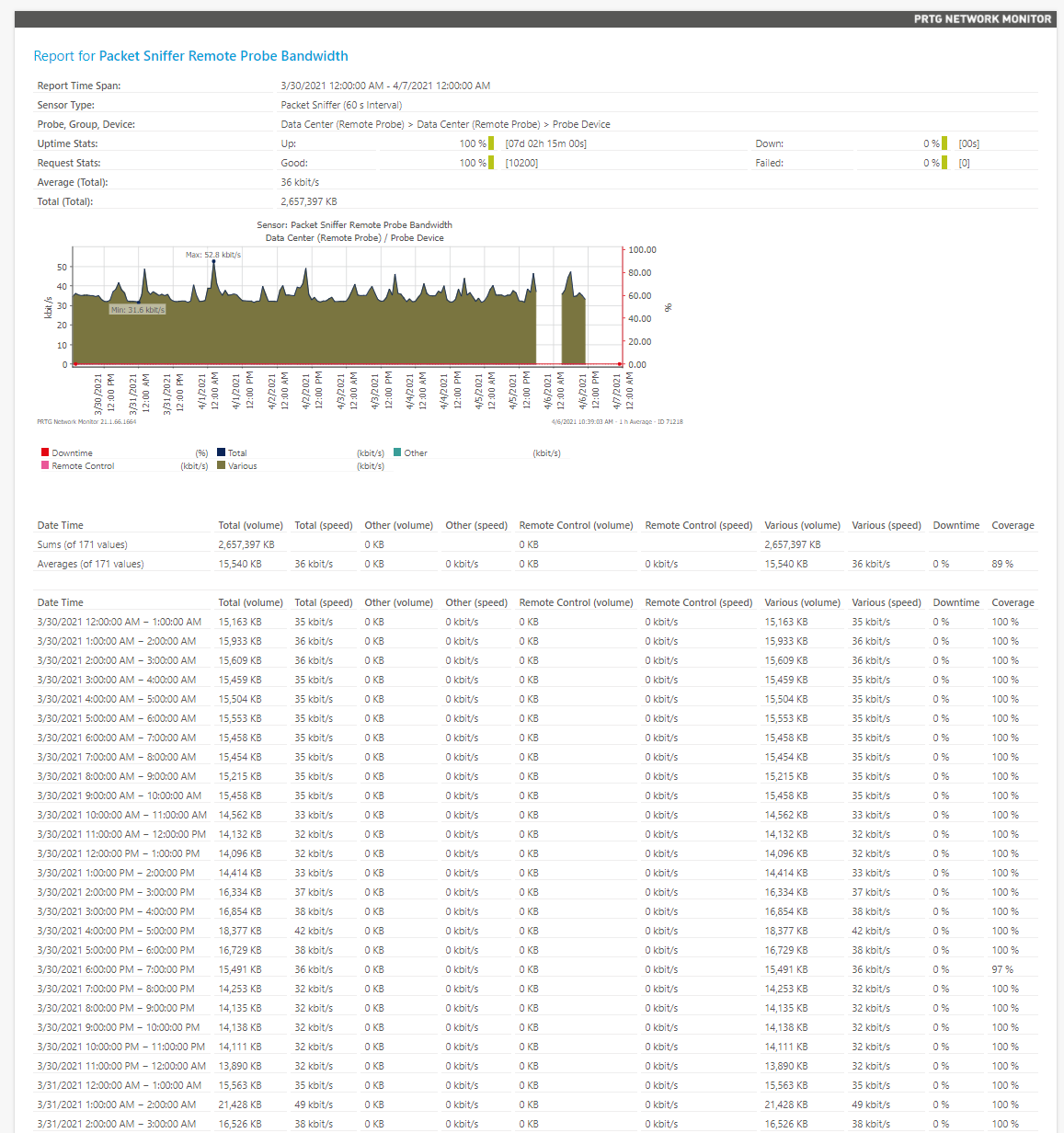
Don’t forget to generate reports that can show more insights into your data. For quick reviews of a sensor's monitoring data, you can use historic data reports. You can run and view a historic data report for each sensor on demand. Additionally, you can export a sensor's historic data as an .xml file or a .csv file to your computer to further process the data with third-party applications. There are two ways to open historic data reports: Either click the Historic Data tab of a sensor or select Sensors | View Historic Data from the main menu bar. In the screenshot below, you can see part of the report for 7 days. Alternatively, you can generate a report by adding several relevant sensors.
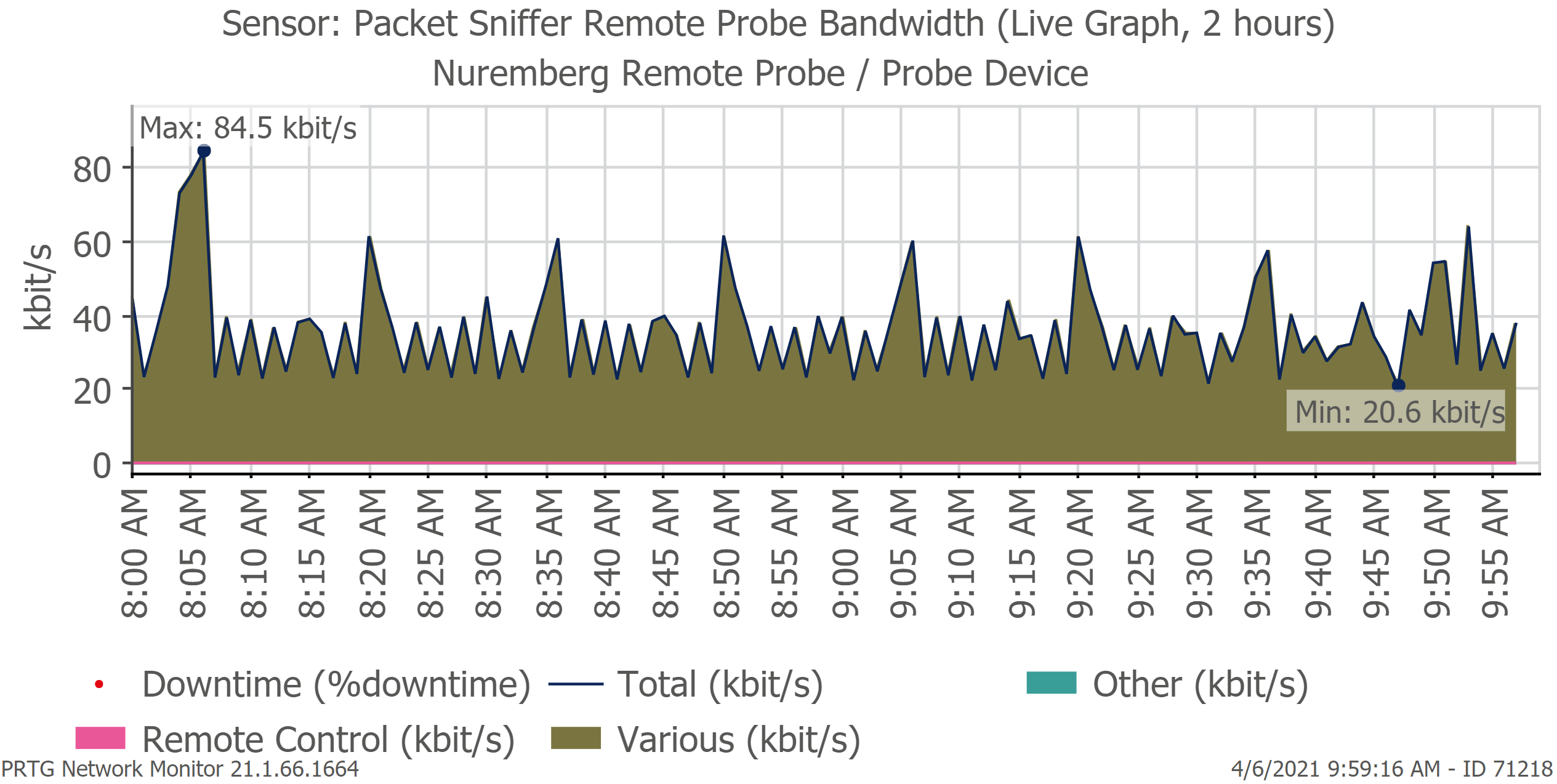
By using PRTG API, you can export live sensor graphs and add them to other web pages. PRTG renders graphs as .png or .svg files. The live graph below shows bandwidth usage between the PRTG core server and the remote probe (3,615 sensors).
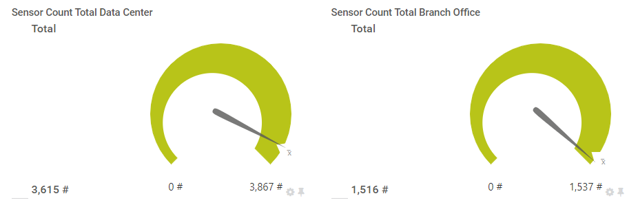
You might notice two sensors on the map that are monitoring the total amount of sensors on each remote probe: Remote Probe Data Center has 3,615 sensors, and Remote Probe Branch Office has 1,516 sensors. Are you wondering how to do this? If so, keep your eye on this blog (and subscribe if you haven't yet). I´ll explain it in my next article.
That is all for today. I hope you found this article useful. As always, we love to read your comments!