With around 20 years on the market, Paessler PRTG is a monitoring product that has accumulated a large fan base over the years. The first version of PRTG Network Monitor still focused on pure ping and traffic monitoring and had a very simple Windows-based interface. Following the general trend, the conversion to a web server architecture took place in 2007. At that time, the web interfaces of many other products on the market offered only an additional, feature-reduced view, mostly in a read-only mode. Not so with us: For PRTG, from that time on, the web interface was the main interface with all functionality available. It is the first place users log in to interact with the product.
Keeping web-based technology up to date
In several iterations and by using the popular Ajax framework, we achieved an innovative, interactive and very flexible web-based operation.
However, there is hardly anything else that becomes outdated as quickly as a web-based technology, which is why we have repeatedly revised our web interface – both visually and functionally. The feedback and wishes of our users have always been the decisive factor.
In order to be well prepared for the future, we have decided to fundamentally modularize and modernize PRTG's architecture. This renewal process is slow but continuous. Throughout this time, we want to continuously deliver and live up to our promise to provide regular product updates to our users. Part of this modernization, we are also fundamentally revising the web interface to be able to implement many of our users' wishes for a more intuitive and faster operation, which are not possible in the current form. In many interviews with users of PRTG, we have learned how we can better support our IT professionals in their daily work with a revised monitoring interface.
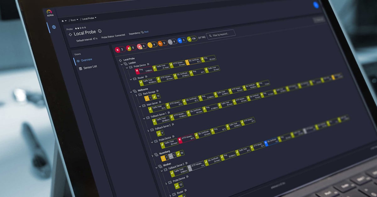
A completely new web interface
Unlike the previous customizations, this major revision requires a change from the existing interface to a completely novel web interface. At the same time, we are working on a new version of our API, which will provide the required functionality for the web interface. A big and brave step for us, and also a challenge for our users. We believe it is worth the effort.
To ensure the transition goes smoothly, our user experience team is working closely with our product owners, developers, and users in constant cycles, ensuring we always get very early feedback on our concepts. Since December 2021, a first test version of the new web interface has been available to all interested PRTG users, which can be activated and used in parallel to the existing interface. This way everyone can already get familiar with the look and feel of the new interface – and send us feedback or wishes.
Important to know:
- In the beginning, the new web interface supports only the most important use cases, but we will add functionality with every PRTG update. We continue to select the most important features first, so that the interface is fun to use in daily work as early as possible and our users prefer using it over the old one.
- Our goal is to reach a point as early as possible where the new web interface is loaded as default and you only need to switch back to the old interface for rare functions. Of course, the complete replacement of the old interface is the ultimate goal.
- Our users should not have to wait until then, but are encouraged to benefit from the user experience of the new interface from the start.
We are curious about your feedback
Our first focus is the use case where users have already fully set up their PRTG monitoring. Imagine that our users receive an alert, for example via email, and log into the new web interface to see what's going on: there they can already view live data on the affected sensor and the other sensors on the device, update the status with "Scan Now", confirm the alarm, and pause or continue monitoring. They can also switch to the device tree and analyze live data from other sensors there, as well as always filter by sensor status or free text in all views. In addition, a sensor list is available that lists all sensors in the installation regardless of the tree view.
In this context, we are interested in feedback regarding the following questions:
- How well does the new sensor detail view work in this use case?
- How does the display of sensor channels help to quickly identify the problem?
- How well does the device overview work in this use case?
- Are the dialogs for pausing or confirming alarms intuitive to use?
- How well does it work when objects are selected simultaneously with multi-edit?
Next, we will add more things to better support the "I'm analyzing an alarm" use case: A device list, a revised device details page, better filters, and the ability to also select and pause multiple devices at once. In addition, we will offer the possibility to directly revoke an acknowledgement for an alarm, which is a frequent request from our users. We are also working on adding, deleting, and editing objects, and after that, we want to make the historical data for each sensor accessible – as graphs and tables.
Thanks, Daniel for these great insights!
This article is part of an ongoing content series titled Joachim and his team. On a regular basis, our CTO Joachim as well as his team will comment on topics of interest to our readers, mostly (but not always) related to Paessler PRTG. If you wish to suggest a topic, please leave a comment.
 Published by


