 Published by Dirk Paessler
Last updated on March 03, 2022
•
3 minute read
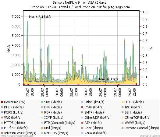
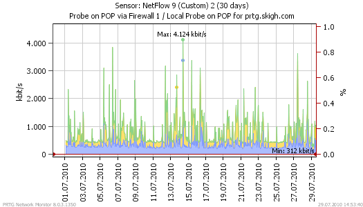
While the beta test of PRTG 8 is running we are posting a series of blog articles about new features! One frequently requested feature was the possibility to show filled and stacked graphs.

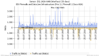
Here you go: With PRTG 8, we introduce an optional new appearance for our data graphs! You can now set graphs to be “filled” or “stacked”, and you can even display data using the positive/negative y-axis, which is quite handy for showing traffic in and traffic out in one graph. The new graph types can be used when displaying live data as well as when generating reports. See some examples below. By the way, you can find the radio buttons to enable these features in the system settings and the sensor settings.