 Published by Heather Pacan
Last updated on July 10, 2026
•
6 minute read
Before we start, let us answer the question: What is a NOC dashboard?
A network operations center (also known in the IT world as a NOC) is like a command center for administrators where they supervise, monitor, and maintain a telecommunications network.
But, the scenario also could apply to the entire infrastructure of an organization to include the monitoring of servers, applications, printers, as well as the networking devices.

Larger organizations with a large infrastructure typically have a command center, a room containing visualizations of the network and IT infrastructure that is being monitored, several workstations at which the detailed status of the network/devices can be seen, and the necessary software to manage the infrastructure. The network operations center is the focal point for troubleshooting, performance monitoring, and coordination of the infrastructure.
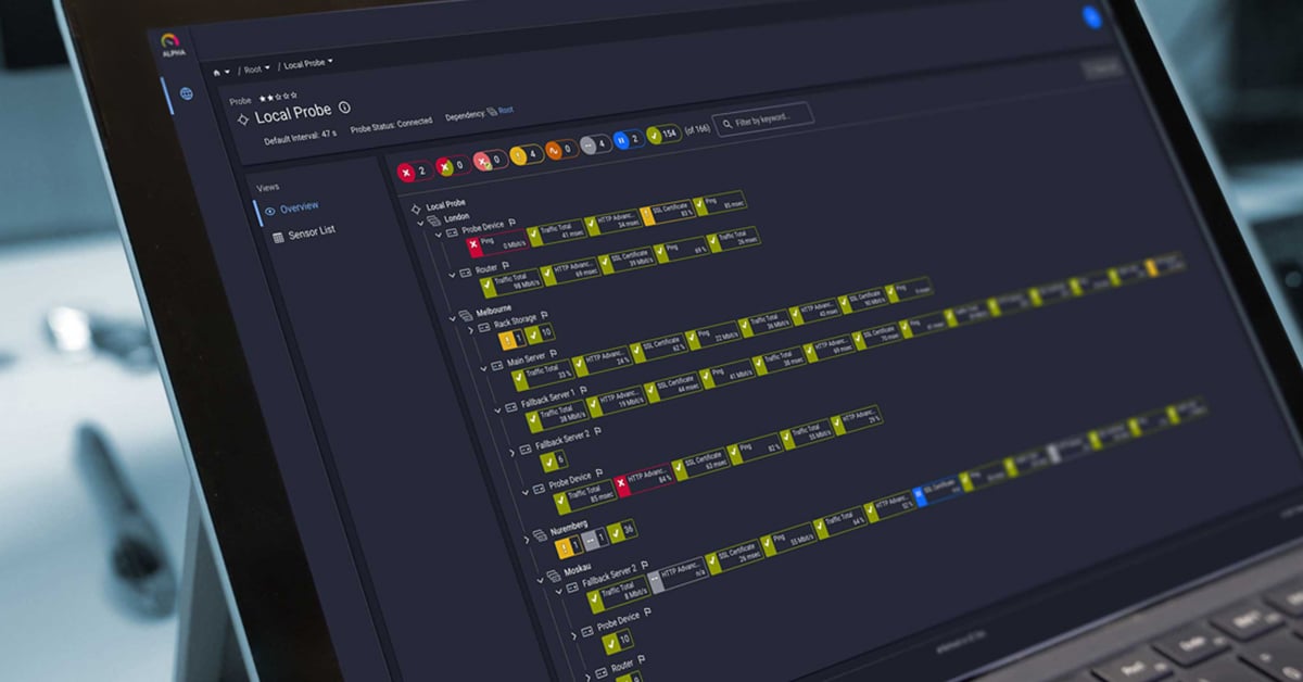
Typically, in the operations center, or the area where the systems administrators sit, is a large monitor or monitors that display maps or dashboards from their monitoring utility – and this can also be known as a NOC dashboard.
Maps = The Dashboard Functionality in Paessler PRTG monitoring software
With PRTG, we have our maps feature – which can also be referred to as dashboards. These are all custom made. Do you ever feel when it is time to go and create a map in PRTG, you draw a blank? I know that I used to have that feeling, and I work with PRTG every day. There is a conceptual process to work through outside of PRTG before you get started. If you are new to PRTG, you may want to check out the Creating Maps tutorial video – this is a great introduction to getting started with Maps in PRTG.
The Map Designer at a Glance
The Map Designer in PRTG is where you will do all the magic – the left side is your Device Tree, and the right side are Properties for the maps – or the way you want to display your data. This is the first step in starting to form your map or NOC dashboard (or in some organizations just a "Dashboard"). To keep it simple, I am going to refer to it as a "map" going forward.
Draw It on a Sheet of Paper First
What do you want to see, and then how do you want to display it? I started with sketching out my map on a piece of paper and this is what it looked like:
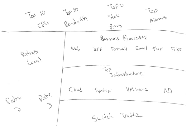
As you can see – I want to show a few tops lists: CPU, Bandwidth, and Slowest Ping, as well as to display my alarms. I also wanted to show my probes. On the right side I wanted my business processes clearly displayed – for these, all I care about is if they are up or down. For my high priority infrastructure, I wanted to display the sensor data. I decided to display my network traffic on my main switch at the bottom of my map. With all of this in mind, and my sketch, here are two examples of what I came up with.
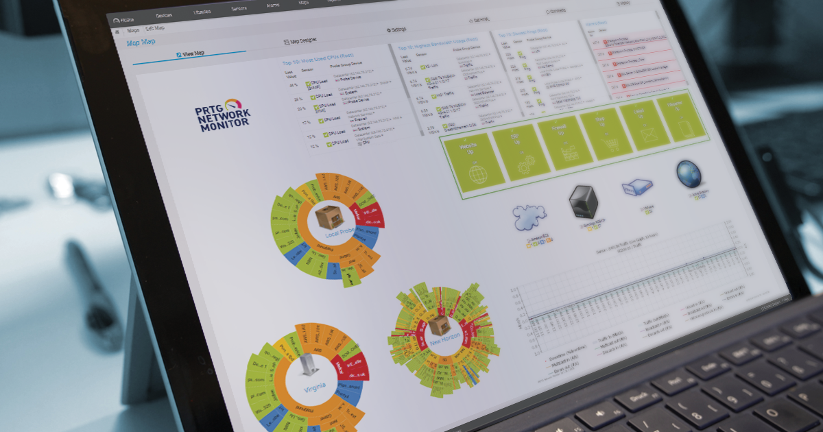
Map #1 with Status-Related Backgrounds and Graphs
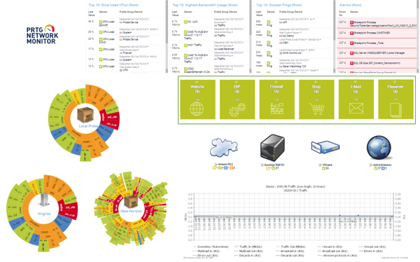
| Map Component | PRTG Map Property |
|---|---|
| PRTG Network Monitor | Default Icons B |
| Top 10 Lists | Top 10 |
| Alarms | Data Table - Alarms |
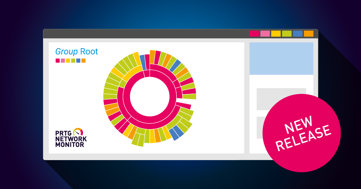
| Probes | Devices - Sunburst with a static icon in the center. I used Icons C (Static) for the buildings/server Custom HTML Element for text* with layer field to overlay |
| Business Processes | Status Icons - Sizeable Icon on Status Related Background with various default icons layered |
| Cloud, Synology, VMWare, AD | Icons A, Icons B, Icons C |
| Traffic Graph | Graphs - Live Graph (Large Fonts) |
Map #2 with Traffic Lights and Channel Gauges
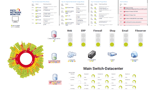
| Map Component | PRTG Map Property |
|---|---|
| PRTG Network Monitor | Default Icons B |
| Top 10 Lists | Top 10 |
| Alarms | Data Table - Alarms |
| Probes | Devices - Sunburst of Root Each probe Icon A |
| Business Processes | Custom HTML Object for text (see How to Add Text*) Status Icons - Trafficlight |
| Cloud, Synology, VMWare, AD | Icons A, Icons B, Icons C |
| Traffic Graph | Status Icons - Channel Gauges Small |
How to Add Text and Layer Fields
If you have read the table carefully, you have probably noticed the *. You can add a simple text box to your PRTG Map using a Custom HTML element. With this method you are able to style your text the way you want.
Our Knowledge Base article How to Add Text to a Map shows you all necessary steps to create your custom text box. You can also have a look at our Maps Designer Manual and learn How to Layer a Field.

Conclusion
As you can see – both maps are similar but with a few differences. The data is all the same, but they are displayed in different ways. I know navigating through the property list can be confusing at first, but practice makes perfect! :)
Do you already use the Maps functionality in PRTG? What is your favorite use-case? We would love to read your feedback in the comments!